How it should feel.
How it has to work.
I design from the person using the thing: what they need to understand, what they can change, and how they know what happened. Then I give it a look that fits the people it is for.
Four rules I keep coming back to.
- 01
Show the state of things.
People should be able to tell what the software is doing, what it already did, and what happens if they say yes. The Staff Desk queues the mail that needs you with a drafted next step, and asks before anything is sent.
- 02
Borrow a shape people already know.
Unfamiliar work is easier to start from a familiar object: an inbox, a calendar, a thread, an assembly drawing. Staff began as an office full of AI employees. It now lives where the work already arrives, in email.
- 03
Give every product its own world.
A job-search product for people who are worn out should be funny and warm. A trading terminal should be dense and calm. The look follows from who is using the product and what kind of attention it asks for.
- 04
Design the transitions, not just the hero shot.
Products have states: docked, detached, exploded, half-finished, failed. Showing those states, and the steps between them, says more than one flattering render.
A job-search product that is on your side.
Job hunting wears people down, and most hiring software feels built for the employer. JoblessNoMore is loud, warm, and funny on purpose, with a design system strict enough to stay consistent across the site.
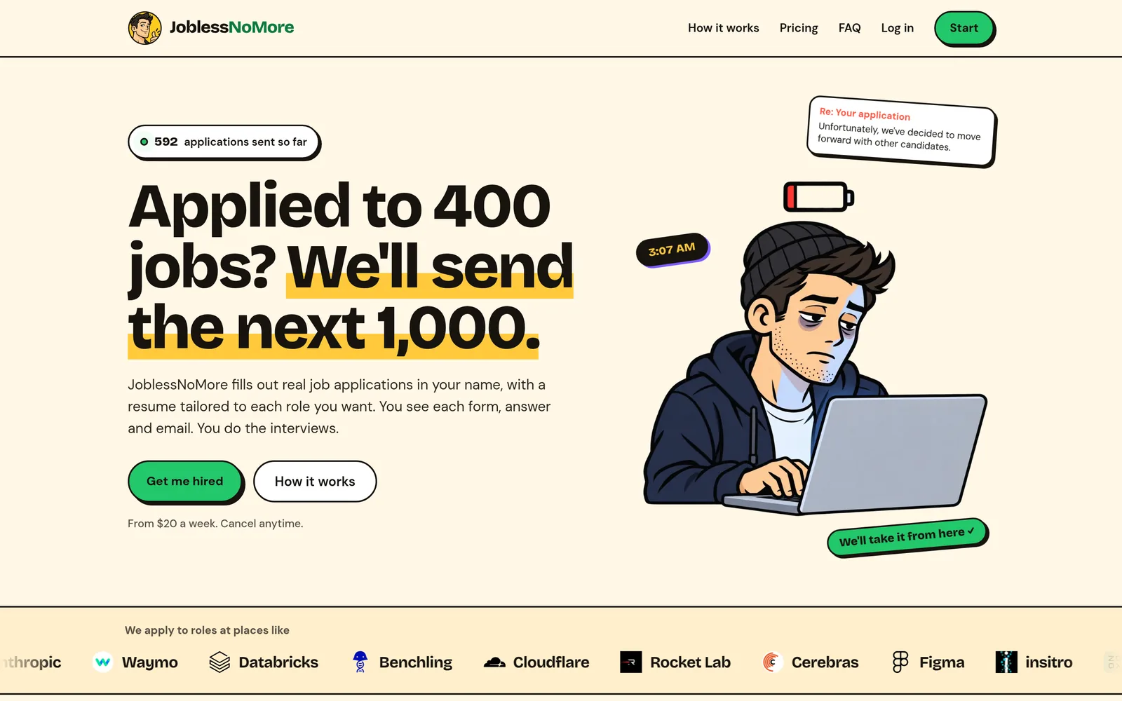
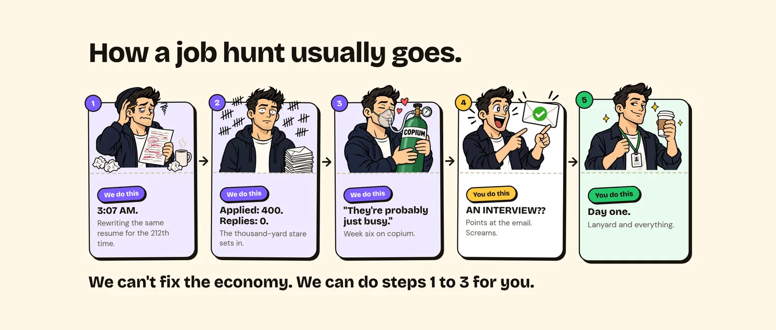
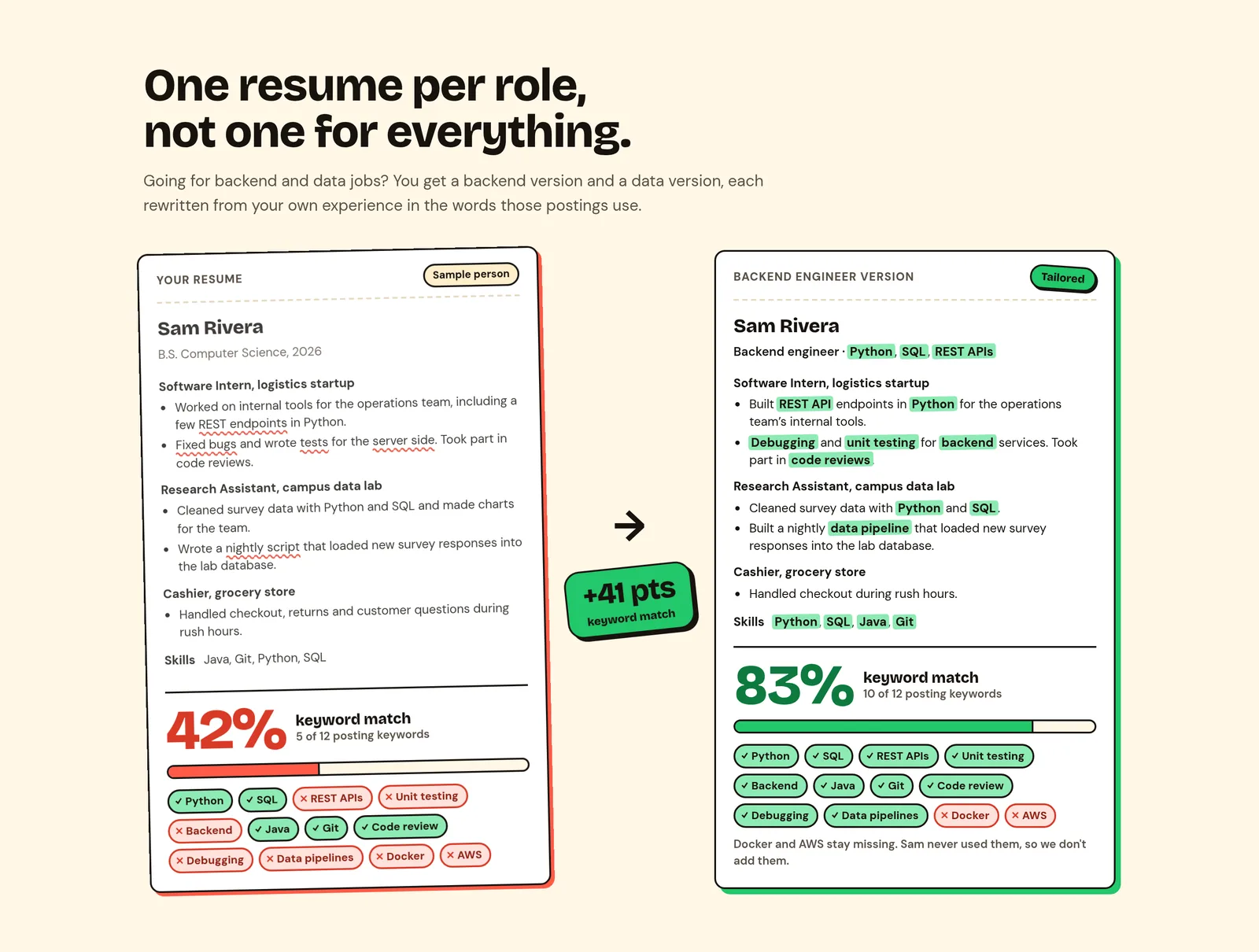
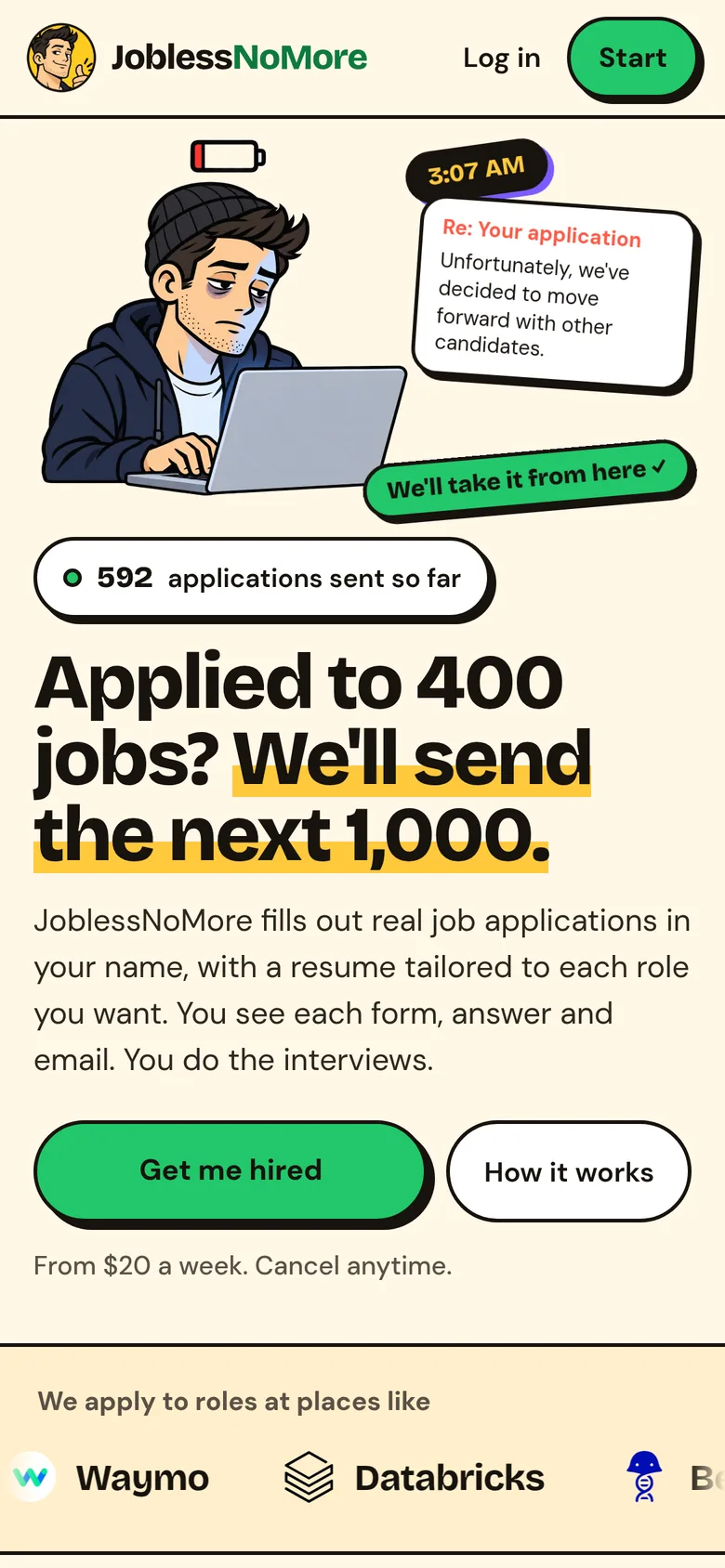
- Comic-strip flat
- Cream paper, warm black ink, 2px outlines and hard offset shadows that lift on hover and press on click. No gradients, glass, or stock photos.
- Accents with jobs
- Green means hired and marks the main action. Violet is for links and focus, red for errors and the doom side of the jokes, yellow for highlighter swipes and stickers.
- One character
- Every illustration is the same tired job seeker from the logo, from the 3 a.m. resume rewrite to day one in a lanyard. Captions stay in HTML, not baked into the art.
- A strict voice
- Jokes are about the job market, never the reader, and each one is followed by a real number. Layouts are checked from 320 px up, with 44 px touch targets.
One designer, many visual languages.
Every project below has its own look. Each one was chosen for its audience and the job it has to do.
Tired, funny, on your side
Cream paper, heavy black headlines, a highlighter stripe, and a cartoon job seeker who has clearly sent too many applications. The joke makes the product feel like an ally rather than another hiring platform.
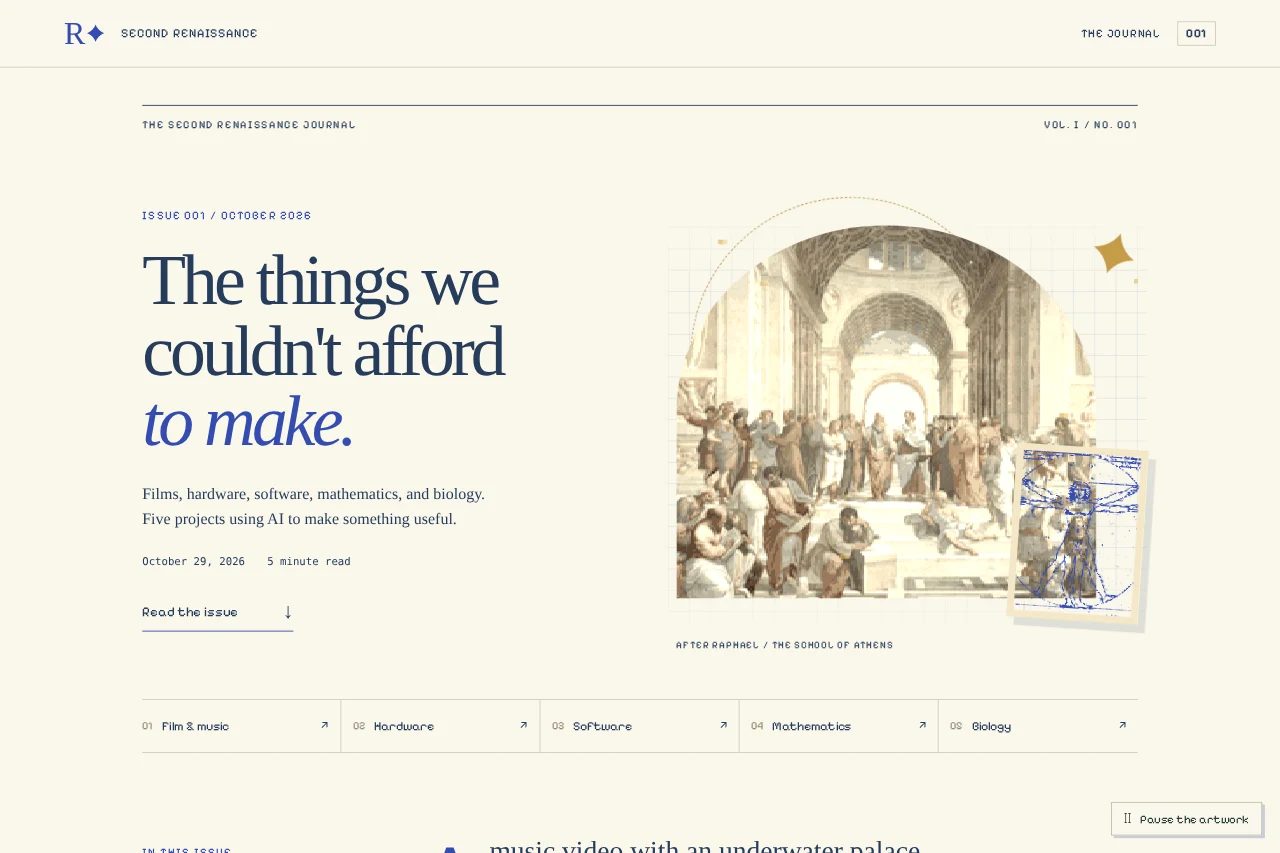
Pixel Renaissance
An editorial journal with Renaissance art reworked in pixels, old-style serif type, and margin notes. The look makes the argument before the reader gets to the first sentence: this is meant to be a flourishing, not a factory.
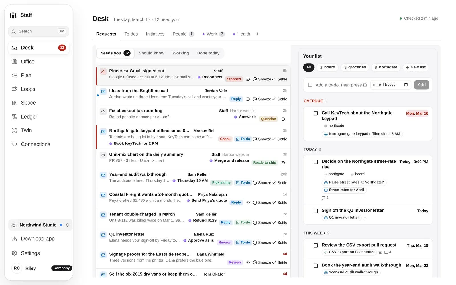
A quiet work surface
The Staff Desk and More With Less are tools for doing work, so they recede. Neutral surfaces and plain type leave room for the content, and color is saved for things that need a decision.
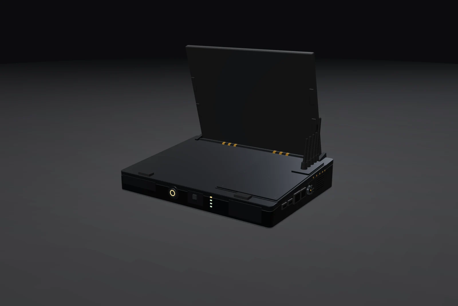
Industrial product
Bead-blasted grey aluminium, a graphite shell, cream keycaps, and one amber key. DECK/01 is presented as an object you could service, with its modules and assembly states part of the design.

Cinematic worldbuilding
For Per Aspera, a neon city and anime-styled characters carry a screenplay into animation and an interactive personal site. Colour and lighting do the storytelling.
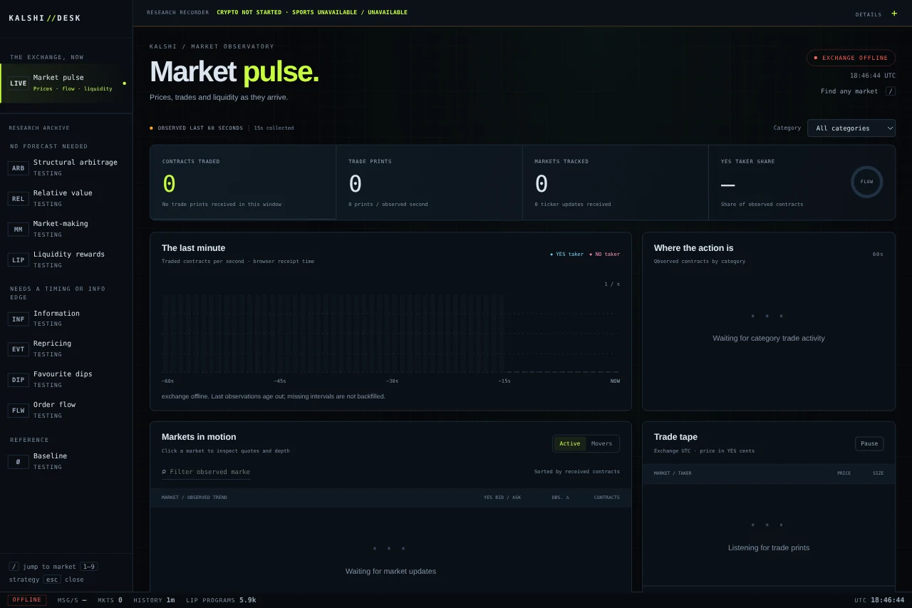
Instrument panel
Near-black panels, monospaced labels, and a single acid-green accent. Dense, but organised so the important number is the one you see first.
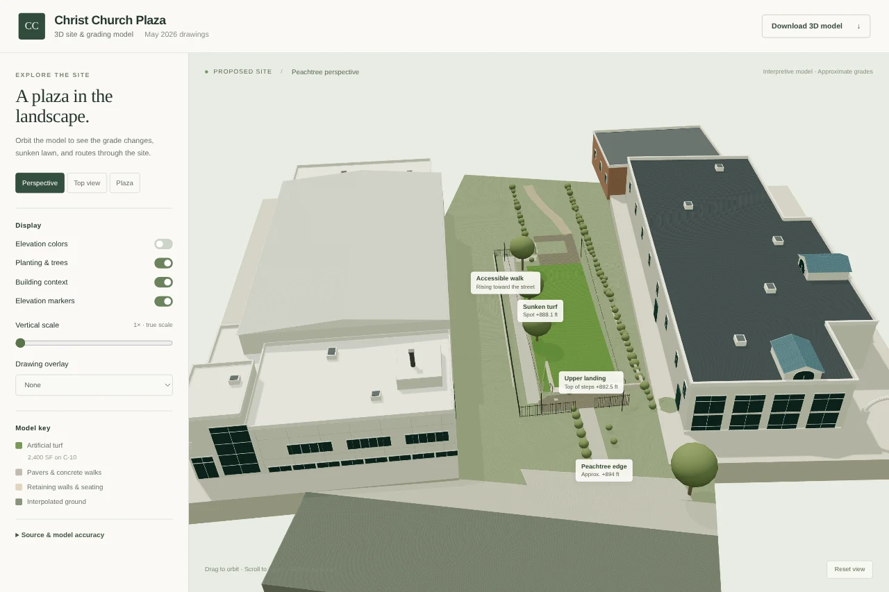
From drawing to place
Architectural drawings rebuilt as an explorable site model, with soft massing, planting, and labels tied back to the source sheets.

Voxel field guide
This site: isometric blocks, pixel type, a paper grid, and a portrait built from cubes that you can turn in 3D. Playful, but still a reference you can scan.
Design is also how the system behaves.
A good-looking interface can still hide a confusing system. These are design decisions made below the screen.
Approve the exact change
An agent’s local edit becomes an exact recorded diff. Approval covers those bytes, and the receipt can be read later.
Earned verification
Each repository earns a verification level. A run can only publish what its evidence supports.
Pricing with guardrails
Rate recommendations pass strategy guardrails, then go through preview, commit, and overrides, with every change kept in history.
Typed product intent
Hardware specifications compile to CAD, and an independent checker verifies the output.
Responsive and authoritative
Client prediction makes driving feel immediate; rollback keeps one authoritative match.